Tension in Design - Pure Design versus Practicality
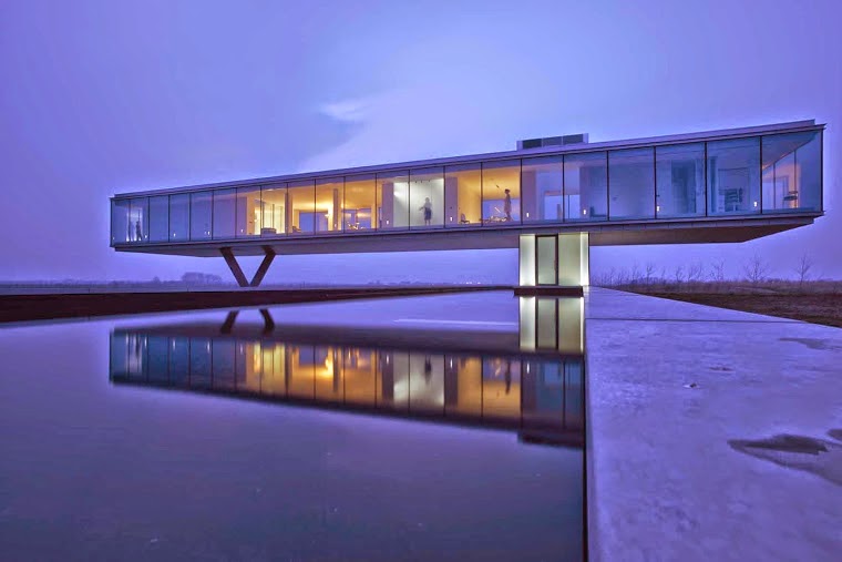 I ran across this image today, from David Getts. The image is his and I'm using it out of Fair Use to discuss the concept.
I suppose it's important to separate the photo from the design. The photo, or I suppose I should more properly call it a render, is dramatic in composition, lighting and setting. The image itself is a great image. But what of the design?
I'm not one to eschew whimsy or the breaking of conventions in design. In fact, I love such things in general. Such things, after all, are why I love the Muppets and the work of Antoni Gaudi and Frank Gehri. But as the son of a dairy farmer, my eye always runs up against something else . . . does it make sense in the real world? Will it work if I had to use it?
This is a case where I suspect the design has overwhelmed the reason for the building. By calling it a home, the designer short circuits a case where it might be practical . . . as an office or museum. But as a home, the design suffers from a couple of crippling practical flaws. The key to this design, the negative space between the ground and the structure, means that it would either be a) cold or b) incredibly energy inefficient. The biggest passive tool for energy efficiency is to use the thermal load of the ground to even out the temperature in a structure. But this home is insulated from the ground. And there is nothing to stop heat loss from all of that surrounding glass. Which brings up the second issue.
 I just happened to be on Google+ today when a posting came across the wire about Massimo Banzi's