Design Influence - Patterns of Home
Primary tabs
 I've started reading "By Hand & Eye", the new book on furniture design by George Walker and Jim Tolpin, but I've not gotten more than a quarter of the way through it so far. When I finish it, I'll write up my reactions. But for now, my reaction is "Yes, I get it, proportions are important and you don't need a ruler."
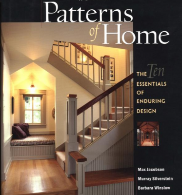
I've been thinking about the multi-faceted aspects of design lately, particularly as it pertains to architecture and object creation (i.e. furniture or small woodworking projects.) I've realized more and more in recent months that most of my perspective on what is good design and what isn't is related to a book that I bought and read about 10 years ago. It's called "Patterns of Home: The Ten Essentials of Enduring Design" and it's terrific. The ideas in that book have completely stuck with me and have deeply influenced many areas of creativity in my life.
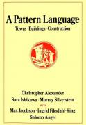
So what is this book? "Patterns of Home: The Ten Essentials of Enduring Design" is by Max Jacobson, Murray Silverstein and Barbara Winslow, and is a condensed version of a much larger work from the 70s, a gigantic book called "A Pattern Language: Towns, Buildings, Construction". That earlier book, first published in 1977, is over a thousand pages in length and is legendary in the architecture world. I've never read the older book. I've only been exposed to the ideas through this later, more graphical Patterns of Home book.
Note: There is NO commercialization on this website. I have no connection to Amazon or any other retailer, nor do I advertise or take samples or other promotional materials from anyone. This allows me the freedom to say whatever I want about whatever I want. I just like to be clear. I point to the Amazon pages for books like this so you can find it for sale if you are interested, but I don't get any money from those connections.
 I've heard some criticism on the newer Patterns of Home book . . . that it's a poor imitation of the real font of this wisdom, the Pattern Language book. I don't disagree that the earlier book seems to be the more complete and serious one, but I still haven't read it. However, I've found the latter, graphical presentation of the material to be hugely influential and instructive to me. In fact, I find all of the glossy, wonderful photos of incredible homes to be very helpful in understanding the underlying patterns being discussed. Design is (mostly) a visual medium, after all, and the visuals in the Patterns of Home are often perfect examples of the concepts being discussed in the text. The other criticism, that this book is elitist; that it desribes architectural design for the super wealthy, is pure bullshit. The patterns have nothing to do with the scale or expense of the home. Granted, the authors picked many examples from the homes of ultra-rich people to illustrate the concepts, but I think this is just a result of presenting the ideals to which the patterns being discussed can be used to achieve great results. And unfortunately, most, but not all, middle class and lower income housing built these days only vaguely utilize these patterns. This is often why we find many homes in less expensive neighborhoods to be ugly or unappealing in some unspoken way. I've noticed this fact more and more since reading this book; one of the additional ways that these ideas have influenced me since reading it. The universal nature of these patterns is brought home most powerfully when I catch sight of a modest home that seems to perfectly embody many of the patterns described. It's not that such homes are rare, you just have to keep an eye out for them. I think the book just gave me a language to describe the feelings I previously wouldn't have known how to explain.
In any case, both of these books talk about 'patterns' in buildings and public spaces, and how these patterns benefit the designs of buildings and the people who live there. The Patterns of Home book clearly focuses on how patterns can be seen in the architecture of single family, private homes. I've read books and seen lectures about the various methods to break down architecture into concepts, but these tend to discuss the concepts of the pure, abstract artist . . . form, function, line, shape, space, color, etc. A 'pattern' is something more human; something more instinctively recognizable by a human being and less based on an etherial ideal. It's sort of the difference between reading Plato's Symposium to understand true love, and the act of actually meeting your soulmate. Still, any discussion of the fundamentals of an art form like architecture (and furniture design) can quickly wander into philosophically dense territory if there is no strong guiding metaphor to structure the concepts. These architectural patterns exist at one level of abstraction up from the pure artistic lines and shapes. It seems friendlier, somehow. And it provides the strong metaphor that is required to assist in giving insight.
In the original encyclopaedic book, I understand that there were hundreds (or even thousands) of individual patterns discussed. Patterns of Home, on the other hand, attempts to condense and boil down the patterns into families of patterns, each with one overriding theme. It lists these groups of patterns into ten distinct, evocative parent patterns, with these names:
- Inhabiting the Site
- Creating Rooms, Outside and In
- Sheltering Roof
- Capturing Light
- Parts in Proportion
- The Flow Through Rooms
- Private Edges, Common Core
- Refuge and Outlook
- Places in Between
- Composing with Materials
Now, the authors spend entire chapters talking about each of these, and each has a surface simplicity, an elegant lyrical quaility, masking a great depth of detail and complexity. But I'll try to explain how I've interpreted each of these families of patterns when looking at potential new homes with my wife. Lately its also given me ideas about how I might want to remodel a home to make it more richly appealing to live within. To me, much of the power of these patterns is that by merely naming them, the ideas they evoke stir an emotional response that seems understandable at an instinctive level, which is what the original pattern authors were attempting to capture. I've often used the names of these patterns, each as almost a koan, a simple phrase designed to spark contemplation and meditation . . . a mantra that helps me focus and center myself when considering a design, whether for a home or a potential design for a piece of furniture.
What do these patterns mean? What truth are they attempting to capture? And please understand that I am not a trained architect, nor am I a professional furniture designer. (But still, I have opinions and I think they provide a unique perspective.) I'd encourage anyone considering these concepts to take a look at the Amazon sample pages provided from the book, because the illustrations give such a wonderful visualization of the patterns being discussed. It's one of the main reasons I love this book.
Inhabiting the Site – I think that this is a more holistic version of Frank Lloyd Wright's idea to make the building fit into the landscape on which it is placed. Too often, with high speed building construction, the strategy is to flatten the site, clear it of all distinguishing features, and then plop the bulding right in the middle, based on a design that could be put anywhere. This is the opposite of that. To get a home that feels like it's alive, we need to pick a design, or tweak a design, or create a design, and position it within the piece of property so that the building and the land become a single entity.
Creating Rooms, Outside and In – Personally, I take this as a mandate to create "rooms", not "spaces". (I absolutely detest the habit of hosts on HGTV and other home shows to talk about "This wonderful space . . . " It's a room, God Damn it! But in the pattern sense, the emphasis is on how the building inhabits the location such that the created rooms inside the dwelling also consider and include the views and windows to the outside as part of the room. It also works to create rooms around the outside of the structure that also have a designed human aspect as well, meaning that you provide borders to foyers so they don't bleed into living rooms, and you provide boundaries to yards and sections of gardens so they don't overwhelm the human inhabitants.
Sheltering Roof – This pattern is the one that is probably most often violated in cheap (and not-so-cheap) housing today. A roof shouldn't just be something you plop on a box to finish the structure. The point of the 'sheltering roof' pattern is that we, as humans, have always valued the sloped protection provided by a roof over our heads as a nurturing feeling provided by a building. The roof, in a good design, should be something that nestles down onto the structure, and wraps itself around the inhabitants in some way. A wonderful drawing in the book shows a pair of hands with fingertips touching, forming the arch of a roof, giving the perfect feeling of the pattern.
Capturing Light – The 'Capturing the Light' pattern family is the one that I suspect has the most variations in the original book. But in a sense this patten is probably the one most easily adapted to a building and the one most often misused. There are a bunch of patterns within this that encourage the structure to capture and flow the light of the outside world and its own fixtures toward and around the inhabitants, wherever they live and work within the building. Some of the ones that have stuck with me the most since reading the book the first time was the requirement that every room provides natural light from two sides, to prevent the light from feeling flat and the occupant from feeling trapped. Another is that it is a good idea that some of the light naturally flows down from above.
Parts in Proportion – This one is the essence of the materials discussed in the Walker and Tolpin book I mentioned earlier. This one doesn't really discuss the concepts of naturally perceived proportion in the same easy manner as in 'By Hand & Eye', but the core concepts are the same. Rooms, architectural features, rooflines, and furnishings should be sized so that natural proportions become obvious, if often unrecognized, to the average viewer. 2:1, 3:2, 4:5 and all of the other ratios that define the classical orders should be used so that no single element stands out as not feeling "right" in the space. Except for large and obvious features of a structure, this seems to me to be the most nebulous and subtle of the pattens to get right.
The Flow Through Rooms – These are the patterns of paths. I like to think of it as designing a garden, with walkways and arbors, along which and through which a human inhabitant will be happy and easy in motion. And it's important to realize that, continuing from the first pattern family: the building inhabiting the site, the first path to consider is how a person, driving or walking, will approach the building. Entryways need a transition space, so large changes, from outside to in, from public spaces to private, don't shock the senses. When 'rooms' are unformed, such as the large outside room of a front yard without a walkway leading to the entrance, there is nothing to guide and reassure a person that the building is welcoming. And the views as one walks through the structure should be considered as carefully as the rooms themselves. If a building is to be a living organism, the veins and capillaries of its blood flow should be clear and obvious and vital.
Private Edges, Common Core – When viewing a house that is new to me, this is the pattern family that often first comes to mind. I think of this as an extension of the sheltering roof pattern, in that private, comfortable places in a sheltered roof design are often at the edges, under the eaves. But the core concept of this pattern is that gathering places should naturally occur toward the middle of structures, so that they feel open and welcoming to groups of people; while bedrooms and bathrooms and private reading places should be situated near the edges, so they feel safe. This natural pattern is also probably why we build cities the way we do, with downtowns and shopping centers, and housing developments with lots of little cul-de-sacs.
Refuge and Outlook – This is my personal favorite, as my wife knows well and teases me about. Whenever I go to a new public building or a new city, I have an instinct to go up to the highest, small space available to look out over the vista. And having such a place in your home is, to me, one of the most fabulous features of a well-designed building. This can be nothing more than a corner on the second floor somewhere with a chair placed near a window so you can look out over the back yard and garden. Or it can be a loft bedroom that looks down over the common room. These are also the favorite places of kids and those who are young at heart . . those who, like my eight year old, are always trying to build imaginary forts where a secret club can meet and look out over their domain.
Places in Between – This is perhaps a variation of Refuge and Outlook, but for 'in-between' locations. These are transitional places that occur between one room and another, such as the front porch, or a foyer, or considering that the rooms may be inside and out, it could also be a bay window, or a reading nook. This is a place in the home where one can look out into one or more rooms, but feel slightly sheltered by an archway, or a doorframe, or a short hall. This is a pattern that embellishes the Flow Through Rooms pattern and the Refuge and Outlook pattern. Many of these patterns weave and intertwine to create a stronger design.
Composing with Materials – These days, it's easier to describe this pattern in the negative. You know how when you go into a modern apartment or recently built middle-class home and all of the walls are painted sheet rock? Everything is painted a shade of white and all of the corners and edges are simple 90 degree planes meeting? This pattern is emphatically NOT that. Originally, this was a pattern suggesting that 'good materials' should be used, but then the authors realized that materials they had previously criticized, such as stucco, and concrete, and aluminum frames, can be used in ways that are rich and useful. The core idea of these patterns is that when picking materials, use each material's own traits instead of trying to hide them behind blandness, as is often recommended by realtors. Display different colors and different textures. As a woodworker, I love the idea of architectural woodworking being included in homes . . . a feature that all-but disappeared for middle and even upper-middle class homes of the 80s and 90s. We have come back quite a bit in this pattern, even when it comes to modern, middle-class, 'manufactured' single-family homes. We now have a lot more tile, with brighter colors, and people now want visible door frames and window fixtures and mantle-pieces. This is where architecture blends into home decor and where these patterns, as details of a building or structure, blend into the features desired in a piece of furniture that will be installed within that structure.
As I write this, I realize that I'm going on too long about the basic ideas. Above, I wrote about the patterns as they apply to architecture. I had hoped to get on and talk about how these ideas, which are fundamentally architectural, can be usefully applied to furniture design . . . with caveats. I guess that part of the discussion will have to wait until Part 2.