Carving the Credo
Primary tabs
 The last update was getting too long, so I'll finish the rest of that here. After I finished fitting the dovetails of the front piece of the front to the endcap, I then worked on carving the credo I had long planned to grace the front edge of my bench. The main reason I left the front board off of the benchtop lamination was so that I'd have a separate piece to carve. It's also a lot easier to carve on a piece resting on a benchtop than sitting on the floor attached to a 250 pound hard maple benchtop.
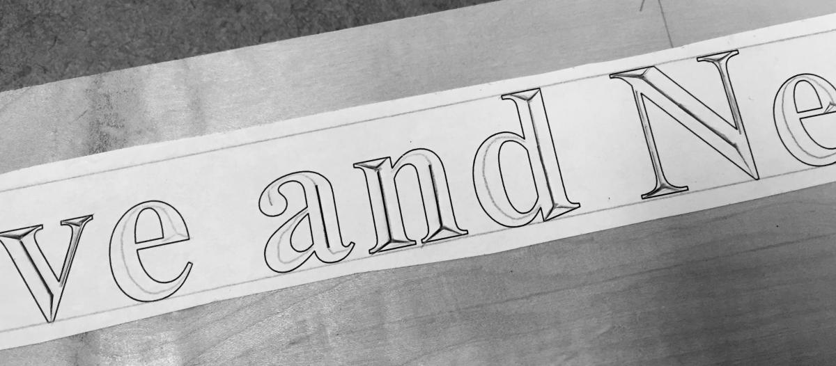
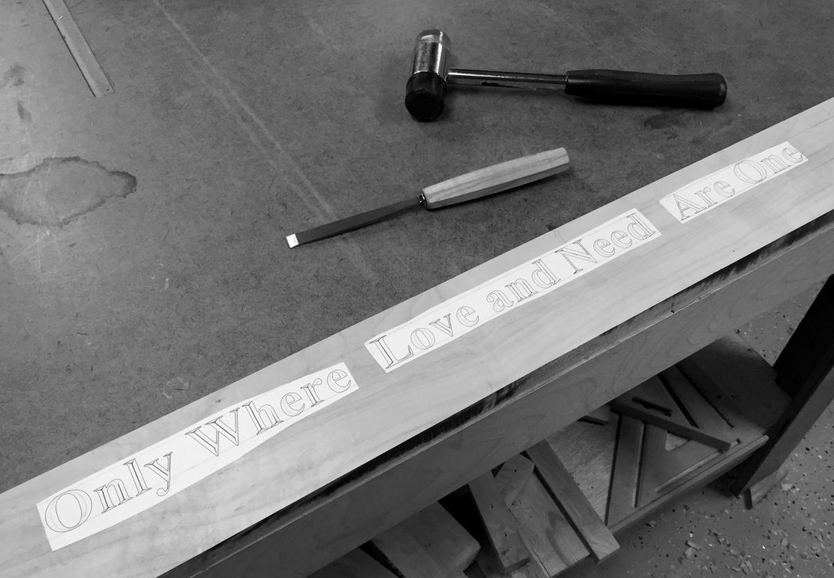 Here, you can see how I've used a spray adhesive to attach the paper pattern to the front board. I'm actually showing some confidence here by making this mixed case. There's a reason why much of the gross carving of the ancient Roman monuments used all capital letters. Capital Roman letters have fewer curves, and curves are alway harder to cut so that they look consistenct. (Think of the letter E and T.) Still, I've carved several signs in the last couple of years, so I decided I liked the more classically elegant look of lower case serif lettering . . . and I had just enough confidence to try.
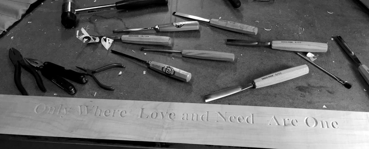
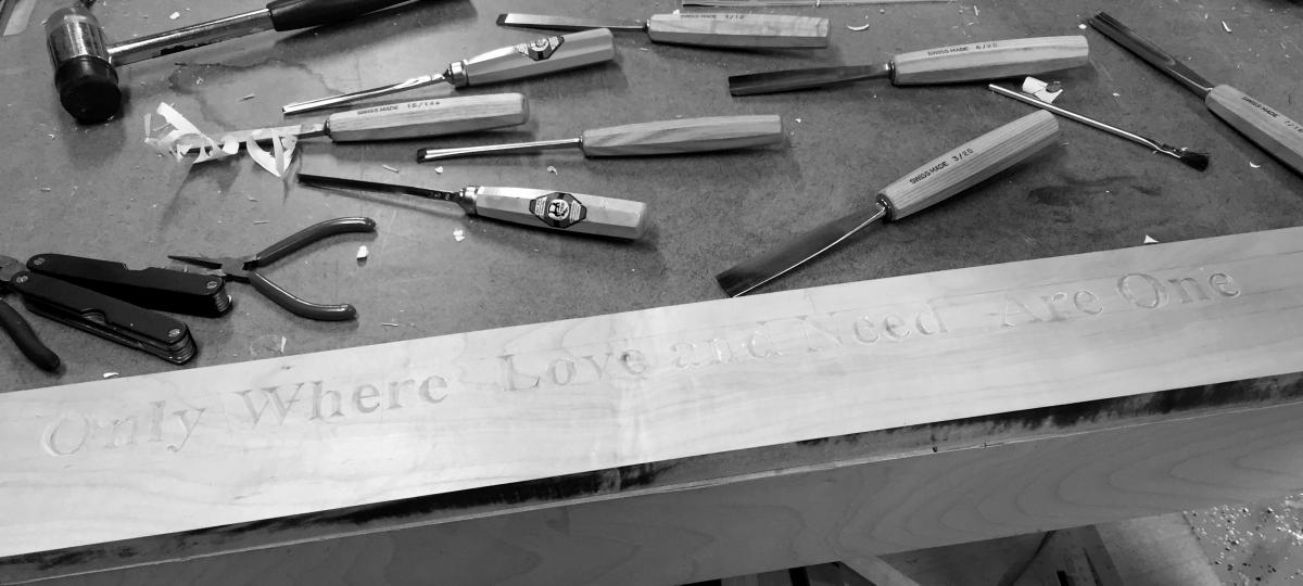
The letters are about an inch and a half tall. One thing that's important about laying out your message is to size your lettering to fit your carving gouges and chisels. At this size, I could use my 6 and 10mm wide chisels, but 12 and 20 were way too wide. This somewhat limited my choices in gouges since I mostly have only one width in each curve size. In carving chisels, a number 1 is a flat chisel. Each higher number indicates a tigher curve, all the way up to a number 12 which creates a very tight curve of diameter of approximately a quarter inch. This curve numbering is known as "sweep". Actually, No. 11 and No. 12 are usually not circular, but rather more U shapped, with the sharpest curve at the bottom of the arc.
 In any case, I needed mostly No 4, 5, 6 and 9 sweeps for these letters. The number 4 Fishtail gouge was especially helpful. The second set of cuts were the angled cuts into each serif. I worked from left to right. It was unfortunate that the phrase starts with the letter 'O', since it's about the trickiest one to get right. It needs to be symmetrical both vertically and horizontally, and minor screwups can look fairly major on this letter. I, of course, to get back into things, started out with the lower case 'L' of 'Only'. Nice, straight edges. There, that wasn't so bad. Then I got overconfident and went after the 'O'. Not great, but acceptable.
 Finishing 'Only' was a trial. It was getting back into carving in a hard wood, but at least I'm used to it. The last big sign I did was for my Sister and her husband and their Oxydizer Servicing company. That was a trial by fire. This was just getting back into the ring with an old nemesis.
It took me a couple of days to get into it, but after finishing the first half of the message, I was determined to finish it quickly. One more all day session last Saturday, and I got the full thing carved. Each curve got easier with practice. It's always easier to do this sort of thing cleanly if you work with a raking light, or a bright light attached to the bench, shining at a low angle across the work.
Up next . . . attaching the frontispiece and endcap to the benchtop. I've already started it . . .
 Altogether, it took me about three hours to complete the carving. I finished the first word in about an hour, and the last five took an hour.